Hello! This is a guide on shadows, shading, depth, and noise. This guide will show you examples of correct and incorrect usages of the shadows, depth, etc. I tried to use the least text that I could to save you from lots of reading, and visual help is usually much more helpful.
Note:
X means "incorrect", and the
checkmark means "correct".
Part 1: Shadows

- plugintutorial1.png (4.08 KiB) Viewed 11956 times
Make sure the shadow is a horizontal line! Also, the shadow should go through the back of the building.

- plugintutorial2.png (3.24 KiB) Viewed 11956 times
Shadows can also be cast on walls. Don't forget that when making more complicated shapes!
Part 2: Shading

- plugintutorial3.png (2.31 KiB) Viewed 11956 times
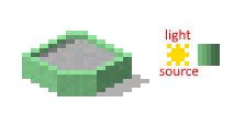
Don't forget to separate the left side from the right side! The left side is lighter, while the right one will be darker.
- plugintutorial4.png (3.34 KiB) Viewed 11956 times
And one more thing about the light, it will always come from the left. The rightmost parts should be the darkest!
Part 3: Depth

- plugintutorial5.png (2.89 KiB) Viewed 11956 times
Adding depth to the windows can make your plugin look so much better! I feel like it's very obvious from the example I've given


- plugintutorial6.png (2.07 KiB) Viewed 11956 times
If you're doing flat roofs, make sure to add a lighter pixel above the walls. It gives more sense of depth and just looks good.
Part 4: Noise

- plugintutorial7.png (3.5 KiB) Viewed 11956 times
Noise can help make your plugin look less like a plastic brick, but make sure
not to add too much noise, or else your building will look very ugly. Noise can be made by adding in a few lighter/darker pixels on your building. It doesn't have to be very obvious.
Part 5: Extra stuff
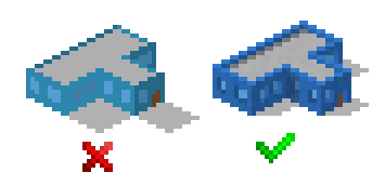
So, after the visuals I've shown to you with a little bit of text, let's compare a building that uses little to no shadows, shading, etc., to a building that uses the said stuff!
- plugintutorial8.png (5.58 KiB) Viewed 11956 times
As you can see, the turquoise building is extremely ugly and will most likely require you some eye bleach

The blue building is just much nicer to look at, doesn't look as ugly and effortless, and has more detail than the turquoise building.
I hope you've learned or remembered something from this tutorial/guide, have a nice day!

PS: If you've found a mistake or know another trick that can help, feel free to post it here! I'll make sure to update this post. Cya!